

Restaurant menu design: 10 tips that make guests order
Last updated:
A well-designed menu doesn't just look good. It helps guests choose quickly, points them to the dishes you're proudest of, and makes your prices feel fair. These ten tips work for a printed menu and a phone screen alike.
In this guide
1. Design for where it's read
Before you choose a single font, decide where guests will read the menu. A large printed card read over a candle, a board read from across the room and a phone read in one hand need different things.
Today most menus are read on a phone at least some of the time, so check every design decision on a phone-sized screen. A layout that relies on two wide columns, or a font that's only elegant at large sizes, won't survive the trip.
2. Follow the order of the meal
Guests expect a menu to follow the meal: starters, mains, sides, desserts, then drinks (or drinks first in a café or a bar). Keep to that order and use plain section names. Clever names like "From the fire" are fine if a plain word sits next to them.
Four to eight sections is enough for most restaurants. If you find yourself adding a section for two dishes, the dishes probably belong elsewhere.
Decide early how you'll mark what guests need to know before they order: spicy, vegetarian, contains nuts. Use a few short marks, explain them once, and use them the same way on every page. Guests with allergies read these first, so they're part of the design, not an afterthought.
3. Offer fewer dishes
The longer the list, the harder it is to choose and the more likely guests are to play safe with something they've had elsewhere. A shorter menu also means fresher stock, less waste and a kitchen that cooks every dish well.
Five to nine items per section is a good range. If you rotate dishes, keep a small specials section and change it often.
4. Put the dishes you want to sell where eyes land
Guests start at the top of each section, so that's where your signature dishes and best margins belong. On a phone this matters even more, because many guests never scroll far down a section.
Highlight one dish per section at most, with a small mark or a simple box, not a burst of colour. When everything is highlighted, nothing is.
5. Write descriptions that make people hungry
A good description tells guests what's on the plate and why it's worth ordering, in one line. Name the main ingredients and one detail that makes it yours: where it comes from, how it's cooked, what it's served with.
"Charcoal-grilled chicken, garlic toum, pickled turnip, warm saj" does more than "our famous grilled chicken". Skip words like delicious, amazing and mouth-watering. Let the ingredients do the work.
6. Keep prices calm
Put the price at the end of the description, in the same size and weight as the text, rather than lined up in a column on the right. A column invites guests to scan for the cheapest number; a price at the end of the line is read after the dish.
Write prices the same way throughout, and if the whole menu uses one currency, you don't need the symbol on every line. Avoid dotted lines that lead the eye from dish to price.
7. Use two typefaces at most
One typeface for headings and one for everything else is plenty. Choose a text face that's easy to read at small sizes on a phone, and give it room: generous line spacing does more for readability than a bigger font.
If your menu is in Arabic as well, choose an Arabic typeface that's designed to sit well with your Latin one, rather than whatever the system falls back to. Arabic text needs a little more line height than English.
Use weight and size, not more fonts, to show what matters: dish names a little bolder, descriptions lighter, section names larger. Keep all capitals for short labels only; a whole description in capitals is hard to read.
8. Let colour and space match the room
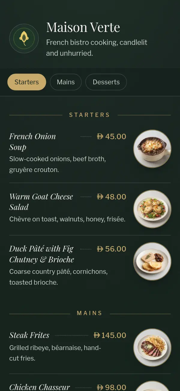
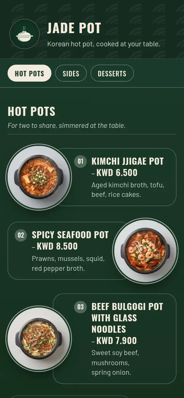
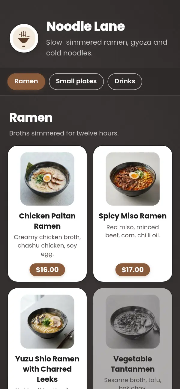
The menu should feel like the restaurant. A dark, warm menu suits an evening bistro; a bold, colourful one suits a lively grill; a light, airy one suits a daytime kitchen. Pick a small palette, two main colours and one accent, and use it consistently.
Whitespace is part of the design. Space between sections tells guests where one part of the meal ends and the next begins, and it makes the menu feel less crowded, even with the same number of dishes.
9. Use photos with care
Good photos help guests decide, especially for dishes they don't know. Bad photos do the opposite. If you use them, shoot every dish in the same light, from the same angle, on a plain background, so they look like a set.
You don't need a photo for every dish. Start with your signature dishes and anything unfamiliar. A menu with no photos at all still looks finished when the type and spacing are good. Never use stock photos of food that doesn't look like yours.
10. Test it, then keep improving
Watch a few first-time guests order. Where they hesitate or ask a question, the menu isn't clear enough yet.
Every month or two, look at what sells and what makes money. Dishes that sell well and earn well stay where they are. Dishes that earn well but sell slowly deserve a better spot or a better description. Dishes that do neither can go. A menu is never finished, and a digital one makes these changes free.
Start from a menu that's already designed
Craftel templates are designed for restaurants and tested on phones, in Arabic and English. Choose one, add your dishes, and your menu goes live at its own link. Free for 14 days.